
Sunday 30 September 2018
NEA - Research Rationale
Research Rationale
I plan to produce a POP music magazine with a target audiance of 14 - 18 year olds. I have a wide access to my target audience, for example i am a student currently in Year 11 which has an age range from 14-18. Also, I have access to young adults and adults to help me build my research. This will help me to gather accurate information and cater to what they look for in a music magazine and what attracts them to purchasing one.
I plan to produce a POP music magazine with a target audiance of 14 - 18 year olds. I have a wide access to my target audience, for example i am a student currently in Year 11 which has an age range from 14-18. Also, I have access to young adults and adults to help me build my research. This will help me to gather accurate information and cater to what they look for in a music magazine and what attracts them to purchasing one.
The reasearch that i will be collecting for a POP music magazine, I will do two types of research: general and focused. I will put together a set of questions around what people’s interests are in music, what they like to see inside a music magazine and what attracts them into buying one. This will help me with my general research as I should be able to gather a good amount of feedback to influence my magazine. As for the focused research, I am planning to get a few magazines already published and show a small group of people; asking them what they like and dislike about them. By doing this type of research, it allows me to get a good understanding of what those belonging to the target audience of my magazine, expect and like to see.
To produce this research i have used Google Forum to create a survey and collect feedback on what the audiabce does either the listen to music or buys magazine.
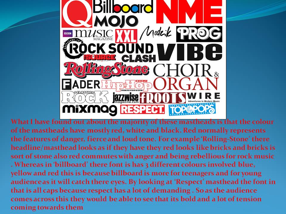
Wednesday 26 September 2018
NEA - Typography Moodboard
Subscribe to:
Posts (Atom)